
Ever wondered why some traders succeed while most don’t?
That’s because successful traders find repeatable patterns in the market and trade them.
Human psychology has not changed since the beginning of time and the markets are always forming the same patterns over and over again.
For example, greed and fear have been the two biggest emotions that traders struggle with since the beginning of time.
And this has not changed even today.
This provides us with a good opportunity to profit from these patterns…
But only if we can recognize it when it happens.
Now, while there are many patterns in the market, there are only a few key patterns you need to take note of as a trader.
In this post, I will share with you the 6 bullish chart patterns that you need to know to read the markets accurately.
Bullish chart patterns can be categorized into two types:
- Continuation patterns
- Reversal patterns
Bullish Continuation Chart Patterns
Bullish continuation chart patterns signify a continuation in an uptrend.
So the first thing you want to look for is whether the market is in an uptrend.
An uptrend is when the market is forming higher highs and higher lows like this:

For the market to go up, it must conform to this pattern.
Of course, it can form lower lows and lower highs in a bigger higher high and lower high wave pattern.
But the general gist is that it has to break previous highs and form higher lows each time for the market to be in an uptrend.
Sometimes it’s very easy to get confused whether a market is still in an uptrend or it’s starting to go sideways or starting a downtrend.
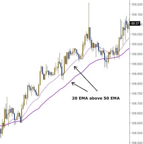
So what I like to do is use the Exponential Moving Averages (EMA) as a simple filter.
I use the 20 EMA and 50 EMA.
If the 20 EMA is above the 50 EMA and is forming higher highs and higher lows, the market is in an uptrend.
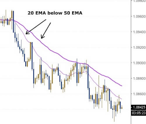
And if the 20 EMA is below the 50 EMA and is forming lower highs and lower lows, the market is in a downtrend.
If the 20 EMA and 50 EMA are crossing each other often, then the market is considered moving sideways.

To look for bullish continuation patterns, we only look for it when the market is in an uptrend.
That means we only look for these patterns when the 20 EMA is above the 50 EMA, and the market is forming higher highs and higher lows.
While these bullish continuation patterns can appear in downtrends and sideways markets, it’s not as reliable.
Let’s get into the 3 bullish continuation chart patterns.
Bull Flag
The bull flag is the most common and most talked about bullish continuation chart pattern among technical analysts.
And the reason is that it’s easy to spot and reliable to trade.
As the name suggests, the pattern looks like a flag with a flag pole.
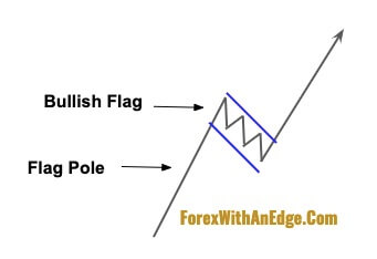
Bull flags form the “higher low” part of the uptrend wave.
When the market makes a bull flag, it moves in between two parallel lines like a channel.

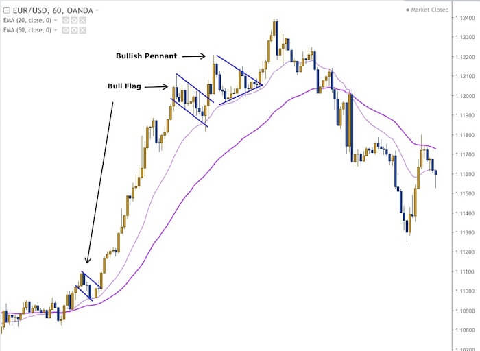
The chart above shows two bull flags in an uptrend.
You can see that the 20 EMA is above the 50 EMA, and the market is clearly in an uptrend forming higher highs and higher lows.
If you noticed on the chart just before where the 20 EMA crosses below the 50 EMA, the market is also forming a pattern like the bull flag.
However, it does not break above the upper channel of the formation, and it starts to break below the previous low.
This invalidates the bullish flag pattern.
And as the 20 EMA crosses below the 50 EMA, we no longer look for the bull flag as the market is turning into either a downtrend or a sideways market.
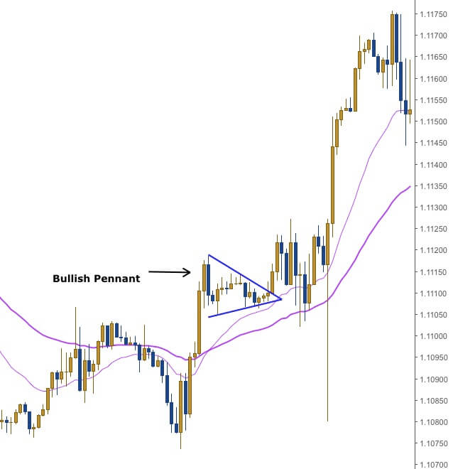
Bullish Pennant
The bullish pennant is another bullish continuation pattern where the market consolidates and forms higher lows.
And the reason it is called a pennant, as you’ve guessed it, is because it looks like a pennant.
In case you’re not sure how a pennant looks like, it basically looks like the “play” button whenever you’re watching Youtube.

So whenever you’re trading the markets and you see this “play” button as the market is in an uptrend, it means there’s a good chance the market is going to go higher.
Let’s take a look at how it looks like on the chart.
So here’s the same chart we used above to identify the bull flags.
But there’s a bullish pennant on this chart as well.
Can you find it?
Just find the “play” button and you will see this:
In the bullish flag pattern, the market will move gradually downward, but for a bullish pennant, it will be moving in a sideways fashion.
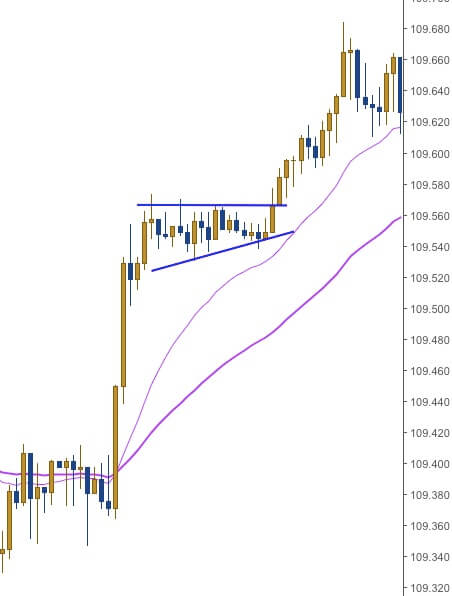
Here’s another bullish pennant:
This bullish pennant formed right after the market broke above its previous highs, and the 20 EMA crossed above the 50 EMA.
However, this is a pretty tricky one because after the bullish pennant is formed, it broke out to the upside, but then came down again to touch the 50 EMA.
At this point, this move would have stopped out a lot of traders.
That’s because most traders would place their Stop Loss directly beneath the low of the pennant.
Once it took out those Stop Losses, the market continued back up in the direction of the bullish pennant.
So while you may have correctly spotted it and took a Long trade, you would still be stopped out if you had your Stop Loss directly beneath the low of the bullish pennant.
Ascending Triangle
The ascending triangle is a bullish chart pattern that looks like a triangle that “tests” the present highs of the current up move.
Imagine you drop a bouncing ball on the floor.
It will keep bouncing until it eventually stops moving on the floor.
And with each bounce, the ball’s bounce will keep getting shorter and shorter.
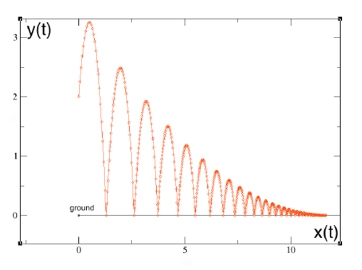
The graph above charts the trajectory of the ball’s bounces.
This is the shape of a descending triangle and is found in a downtrend.
Inverse this and you have an ascending triangle.
The ascending triangle pattern keeps testing the highs until it finally breaks through it.
Here’s how it looks like on the charts:
Now, here’s something to pay attention to with regards to all 3 bullish continuation patterns…
And that is to NOT get caught up with the naming of the pattern.
These chart patterns shouldn’t cause you the confusion as to whether is it a bull flag, a pennant, or an ascending triangle.
In many cases, they can look very alike.
The market does not fit itself into these shapes just for you to name them.
Rather, you want to realize that the market is getting into a consolidation mode and is most likely ready for another move to the upside.
That’s what’s important as a trader.
Now that we have covered the 3 bullish continuation patterns, let’s get into the bullish reversal patterns.
Bullish Reversal Chart Patterns
While the bullish continuation chart patterns indicate a continuation in trend, the bullish reversal chart patterns indicate a reversal in trend.
These are the 3 main types of bullish reversal patterns that happen in the markets over and over again.
Double Bottom
This is by far the most popular type of bullish reversal pattern.
And is one of my most favorite reversal patterns to trade when used with divergence.
The double bottom forms when the market is finding it difficult to make a significantly lower low and is a sign that the bulls are taking over.
To easily identify the double bottom, I only look for them when the market is below both the EMAs:
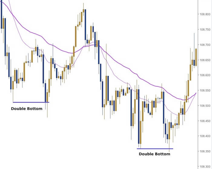
In the chart above you can see that there are two double bottoms.
Some of the best double bottoms are formed when the 2nd bottom breaks below the 1st bottom’s low and the close above it.
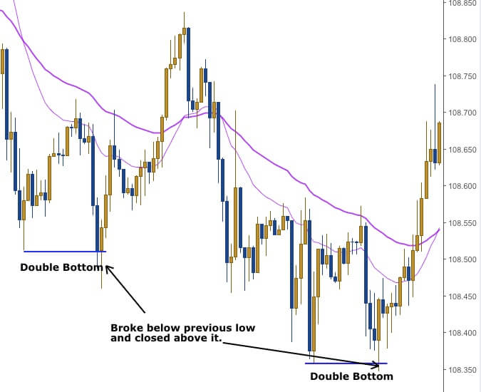
This can be a very reliable chart pattern when you use it with divergence on the stochastic indicator.
Inverted Head And Shoulders
The inverted head and shoulders pattern is similar to the double bottom except that it has 3 “bottoms”.
Here’s how it looks like on the charts:
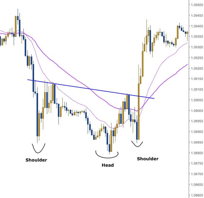
In the chart above, you can see that the shoulders do not go lower than the head.
The significance is on the last shoulder because when it does not break the low of the head (which is the previous swing low).
This signifies that the market is potentially reversing.
If you remember, an uptrend always forms a higher high and a higher low.
So when the market failed to break below the lows created by the head and starts going up…
This becomes the first higher low of a potential uptrend.
And when the market breaks above the previous high, it is now in an uptrend.
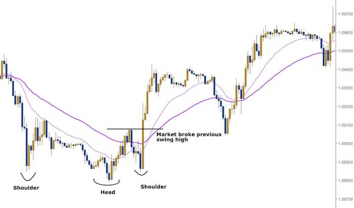
When the market broke the previous swing high, this showed that the market is now starting its uptrend.
And as you can see, the market started to trend higher from there making more higher highs and higher lows.
V-Shaped Reversal
The V-shape reversal is a sharp market move downwards and followed by a sharp movement upwards.
And hence it forms a “V” shape.
Unlike the previous two reversal patterns, the V-shaped reversal can come quite suddenly without any signs.
For example, for a double bottom to be formed, the 1st bottom has to be formed first.
And when the market came down a second time and reverses back up around the lows of the 1st bottom, we can easily identify that as a double bottom.
Similarly for the inverted head and shoulders pattern, the 1st shoulder and head will form first.
When the market came down for the third time but does not reach the low of the head, we know an inverted head and shoulders pattern might potentially be forming.
But with the V-shaped reversal, there is no “1st bottom” or “1st shoulder” to give us a signal that it is forming.
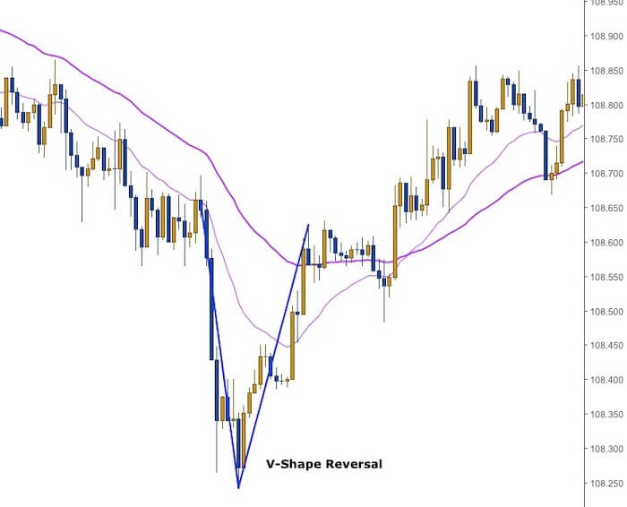
On the left-hand side of the chart, the market is trending downwards in a rather gradual manner forming lower lows and lower highs.
But as it started to move lower, there is a sudden move to the downside.
A Bullish Engulfing candlestick is then formed and the market bounced back up very quickly forming this V-shaped bottom.
Such a move is usually because of some news that just came out, or the market hitting a strong support level.
While V-shaped bottoms can provide a pretty good trade, it can be hard to enter because the reversal can happen suddenly.
Now, if you’re thinking whether you can go Long after the Bullish Piercing candlestick is formed…
The answer is yes…
BUT only if this bullish candlestick pattern is formed because it broke a previous swing low.
But do not enter into a Long trade every time you see a bullish candlestick pattern formed.
It’s the fastest way to wipe out your trading account.
Her’s an example of a V-shaped reversal forming after breaking a previous swing low.
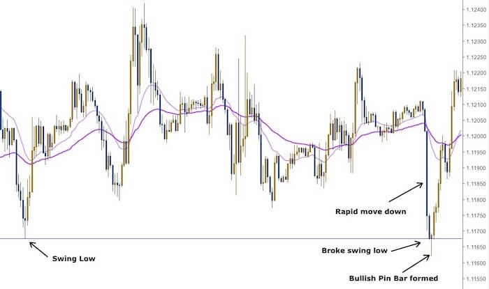
On the left-hand side of the chart, you can see that the market created a swing low.
This swing low was then later breached as you can see on the right-hand side of the chart.
The market made a big move down and in just two bars, it broke below the swing low.
After that, the market then came back up and formed a Bullish Pin Bar.
At this point, then it would make sense to go Long because you are buying on a support level.
Furthermore, if you look at the chart from left to right, you will notice that the EMAs have been crossing each other frequently.
The market hasn’t been forming higher highs and higher lows, or lower highs and lower lows either.
This means that the market has been moving sideways.
So this would be a good Long trade to take as you are buying off a support level in a sideways market.
Now, that you know the 6 bullish chart patterns, it’s time for you to go identify it on your charts.
The more you see these patterns, the more easily you will be able to identify it.
One more thing…
Did you like this post?
If so, would you please share it?
Remember, sharing is caring, and it won’t even take 5 seconds of your time.
So go ahead, click the share button below now to help more traders get an Edge trading the Forex market 
It’s hard to find knowledgeable people about this topic,
however, you seem like you know what you’re talking about!
Thanks